Irina Rustamova
Alexander Tikhomirov. Colour and form. The artistic method // A world of antiquary: the reflection of our essence. Herald of the antiquarian market. 2014. №. 7. p.150.
The online publication has been carried out with permission from the original publication.
Every individual has their own way of entering the profession. Alexander Dmitrievich Tikhomirov (1916-1995) was born and raised in Baku. He loved to draw from a young age, and enrolled into the Baku Art School, where his studied under his professor Ilya Ryzhenko, graduate of the Saint Petersburg Academy of the Arts, who had continued in the tradition of Repin and Makovsky. In the words of Tikhomirov, he owed to none other than Ryzhenko his “strong base of realism and the cultural knowledge of art”, which became a great foundation for individual development.
An interest for modernistic western art, the capability for creative, free thought, based on the harmony of colour relationships, the love for juicy cezannist art – he acquired all these in later years, in Moscow, at the art studio of A. Osmerkin, who, in the opinion of A. Deyneka, was a “man with the perfect sense for art”. On I. Ryzhenko’s recommendation, in 1944 Tikhomirov, upon consideration, was enrolled straight into the Third Year graphics course at the Moscow State Art Institute.
The young artist’s complete artistic preferences and tastes developed in the sphere of “Moscow’s cezannists”, whose acknowledged leader was R. Falk. The circle of these masters, genuine yet rejected by Soviet propaganda, in future years had a particular influence in part, too, on the reclusive nature of Tikhomirov’s work. In 1947, an accusation in formalism and the promotion of western trends was directed at Tikhomirov. Almost the entire class, including the students’ mentor, Alexander Osmerkin, was expelled due to formalism. This occasion resulted in the departure of the artist to start a life of independent artistry, in which he was not dependent on influences, trends and associations.
From then on, the collections of city museums and, in no lesser degree, the tomes with reproductions of the works of great artists of the past, endlessly leafed through by Tikhomirov, became his main companions in his professional dialogues and searches. Quite early on, he began creating his own collection of art catalogues – often these were Italian, brought over by artists of the Bolshoy Theatre and sold in secrecy in one of the city centre book stores.
As is often the case for serious artists, his work absorbed both the art of older masters of the Italian Renaissance – Bruegel, Bosch, Van Gogh, impressionists, Vrubel – and the art of contemporaries. He was inspired by the work of Pavel Filonov, Alexander Volkov, Robert Falk, maintaining R. Falk’s enthousiasm for “precious”, pearl-shimmering, multi-layered art, while simultaneously valuing A. Volkov’s bright oriental colours, filled with an internal fire, as can value a person born and having lived his childhood and teenage years in Baku, a city marvellous in texture. As did A. Volkov, throughout his whole life Tikhomirov retained an interest for the work of M. Vrubel, whose catalogue was his reference book. He delved into the artwork of the other artist, studied his technique, himself tried working in the master’s manner. Having said this, in any search for a plastic means of expression, Alexander Tikhomirov remained true to himself, choosing his topic and staying with his own artistic style. The heritage of past times, fragments of technique, colourful arrangements, motives – he took these things into his future artistic life as vital baggage.
The artist used primed canvases as a base for his oil paintings; in his works we can also sometimes see his own distinctive base, densely filling the space of the canvas and applied in quite an opaque layer, to the point that it is almost impossible to determine the texture of the canvas. Less often, we find orgalite and cardboard in smaller-scale works.
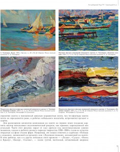
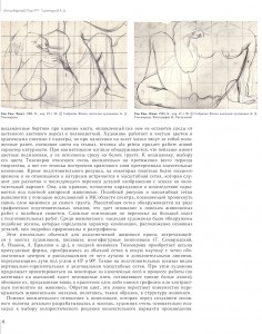
As a first step in creating a painting, the master used a preparatory drawing, most often in pencil or charcoal, in order to correctly position the elements of the composition. This drawing is often hidden from the eyes of the viewer under multiple layers of the painting, yet it remains present in the background of joined forms in works of the early art period of the 1950s-1960s. This can be noticed, for example, in the works “Boats”, painted on orgalite, or “A Boat Dock”, painted on a canvas. In these works, as in other landscapes of this time – “Sudak”, “Autumn in Crimea”, “Bazaar”, “Sun” – the brushstroke is thick, pasty; it leaves wide, bulging borders at the press of the brush, is blended (there remain no marks on it from the mop brush’s bristles), and full-colour. The artist works with both plain colours and colourful mixes from the palette, yet at the application of it onto the canvas, the brushstrokes pull behind them those applied before, mixing the connecting colours. This ala prima technique gives the work a lively, natural character. At a closer look, we find that the landscapes have colour underpaintings – the works are not carried out straight away on a white base. Tikhomirov gave careful attention throughout his whole period of artistry to the the underpainting, to its colour choice, meanwhile his technique for creating the colour layer underwent significant changes. Some of the canvases of the later period and those not depicting the natural environment not only incorporate a preparatory drawing, but also show the use of the grid, which serves as a marker and allows for the subsequent transferal of compositional details from the sketch to the final variant. Usually, it is drawn on in pencil and, subsequently, is hidden under the artist’s thick paint. Similar artwork and grid can be seen with the help of investigations in an infra-red spectrum, allowing us to see through the layers of paint to the very base.
The grid is found in a number of preparatory graphic sketches, which gives the grounds to search for artworks with a similar theme. The artist transferred difficult compositions from preparatory drawings onto a big canvas. Such sketches, which determined the character of a composition, the placement of the main details, have been found amongst the works of the artist; they are drawn and ruled out in detail. This technique, initially ordinary in academic art, and one seen in many artists who painted multi-figural compositions (G. Semiralsky, A. Ivanov, A. Brulov, and others), in Tikhomirov’s later art acquires rather peculiar forms, transforming from a normal grid into a kind of web with a clearly defined centre and outward-bound rays and extra lines, which criss-cross the rays at a 45- or 90-degree angle. Vertical-horizontal and diagonal grids can also be seen on preparatory sketches. Having said that, the artist, in the process of his work, continues to base the drawing on some of the sketched axes (he would pull coated strings, which left thin white lines, over the dry canvas), renewing them, once again pushing them out in a colourful layer or applying with a stylus or contrasting pigment onto the work. Acquiring colour, these lines cease to be overlapped everywhere by brushstrokes of paint, integrating themselves, thus, into the structure of the artwork.
In addition to the attentiveness given to the composition, which is planned out in detail through sketches prior to work on the main canvas, the artist would very thoroughly approach the choice of colour palette for the final variant of the work. Even at the preparatory stage he would apply several colour variants for an already found composition, would convince himself in the advantage of one over the rest, and, only then, would begin work on the big canvas. Several such variants of graphic sketches of oriental baths – the series on the theme “Well-spring” with a group of naked female bathers – have survived as part of the artist’s heritage. It is interesting that, in one of the windows, there appears the recognisable image of the Baku landscape, with a part of the city and the sea. It is important to note here that Tikhomirov often returns to his past scenarios, reworking their compositions and colour arrangements over and over again. It is in this way that he works on the “Well-spring” theme, or the clown (theatre-circus) series. Evidently, the artist did not sign all the works at once; rather, often did not date them at all, and it is very difficult to trace which stages of the process of creating the work the artist was following.
Several changes in Tikhomirov’s “creative kitchen” over time should be noted. It has already been said that the artist transformed the grid, weaving it into the details of the painting. He experimented equally substantially with the texture of the painting’s surface, ultimately finding the unrepeatable “Tikhomirov” style. The partiality for both the blocking-in texture, where each brushstroke is filled with its own colour, and those works carried out in soft pastel shades yet at the same time retaining the pastose nature of the brushstroke, changed, this time not excessively, with the coming of a new theme into Tikhomirov’s art, which demanded a new solution for plasticity. From a kind of realistic impressionism, which characterises his landscape and portrait scenario frameworks, the artist moves to a world of symbols and allegory, where symbol personages appear – “Melancholy” (1952), “Cry” (1958), “Victim” (1960).
His attitude towards the composition drastically changes: the space becomes closed, thick, limiting the freedom in positioning figures, which now twist into positions that are complex, broken and unthinkable in terms of natural human poses; their palms and feet are exaggeratedly enlarged, limbs twisted, joints wrenched; instead of faces they have metaphorical masks; instead of staring eyes, slits or closed eyelids. It is impossible to not mention in this stream the influence of P. Filonov’s artwork, with his characters, who are bestowed with large, gnarled hands with a kind of “palmar subterfuge”. But a closer look at the thematic and stylistic execution of the works suggests a different general feeling to Tikhomirov’s canvases. Filonov is dry and fractional; he constructs his compositions from the concrete to the general, putting together the whole picture; he creates it from various multi-sized details, colouring it as if the details are produced by one sole master. Tikhomirov, on the other hand, builds his work from the general to the concrete; he gives priority to compositional unity, compositional density and wholesomeness before approaching detail. To him, it is important to find and carry across the deep emotional component, that to which all the expressive means that he uses are subjected to – the organisation and rhythm of the compositions; the “talking” details, sometimes openly lying on the surface or demanding to be decoded; the balanced or dynamic poses; the carefully planned out colour scheme, which has particular importance for emotional perception; and, finally, the structure of the artwork itself.
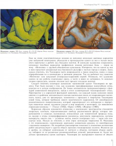
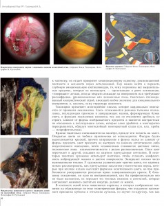
Tikhomirov utilises the technique of multi-layering, which differs radically from the academism principle. Here, the difference between the thickness of the underpainting, the subsequent additions and finishing strokes, which form reflections of light, is mitigated. The function of the underpainting is changed, as it becomes fractional, does not build, is dependent on the form of the expressed object and is also contrastive in regards to the subsequent layers, which themselves break up and numerously fold over each other, creating a multi-layered, multi-coloured fusion (see ill. samples – photomicrography).
The colours are thoroughly mixed on the palette before they are applied onto the canvas. Basic colours from the paint tube are almost unused. It seems the figures are moulded by the paint, and the direction and form of the brushstroke do not depend on the form of the object, while the colour of the object is not based on the laws of natural or artificial lighting – the patches of colour become almost independent, subservient only to the mutual relationship with the colour beside it. One colour blends into the next, creating peculiar combinations in the painting. On some canvases, the artist uses a palette knife in order to smoothen the conflicting surface which vibrates with brushstroke and colour. He completes the work with carefully mixed shades. The artist has a phenomenal feeling for colour; his paintings can be viewed as a bizarre geological layer of rocks, which, at a distant glance, appears as forms in an unpretentious shade, yet at a closer look reveal a scatter of bright, mesmerising colours. Unfortunately, not one of the photographic reproductions, not matter how professionally done, is able to carry across the nuances and combinations of colours which make the art shine from within, making it come to life.
In the context of the new theme, paintings appear in which the image is divided into geometrical figures close in colour shade. This is distantly reminiscent of the cubism principle, as well as carrying echoes of rayonism, yet feels different, as the forms themselves have more plasticity, are real, human-like, and radiate an emotional charge, actively utilising poses and gestures.
Tikhomirov’s efforts to spread the figures onto the flat plane, his yearning to show simultaneously all the angles of their poses, to maximally fill the space of the canvas with them, sometimes leaving parts of the body beyond its boundaries (let us note that the heads of the personages are always intact, though tilted or squashed into their shoulders), but allowing them to be recognised, only his personages tend to be interlaced, twisted, with crossed over limbs – all this is an original technique that has remained distinctive and steady throughout his whole artistic period.
During his youth, due to a street fight in Shamakhi (an unsafe district in Baku), Alexander Tikhomirov was blinded in one eye. One could only imagine what this would have meant for a person with the aspirations of becoming an artist. It is probably unnecessary to explain the importance of binocular vision, and an artist’s need for it, as his main task is to form a prospect on a canvas: to transfer a three-dimensional image of the seen world and its objects onto the plain surface. And so we have before us the feat of an individual, who was able to overcome such challenges which would not only have forced another person to change their profession but even cause a breakdown under the weight of such adversity.
Having lost sight in one eye, Tikhomirov was not conscripted into the army, yet for him, as it was for many artists of his generation, the Second World War, in which many took part, was a sacred topic. The Holocaust, which carried away the lives of six million people in World War Two, could not leave him indifferent to these events, instead awaking memories of the suffering experienced by his own family (his parents had told him about the massacre of Armenians in Baku in 1918; about the time when they themselves, being Russians, almost fell victim to the blind violence). Tikhomirov was one of the first in soviet art in the mid 1950s to promote the tragic theme of Babi Yar. (The famous poem by E. Evtushenko, “Babi Yar”, the №13 symphony by D. Shostakovich, the document-novel “Babi Yar” by A. Kuznetsov, who found himself a witness to those awful events. Many emerged only in later years – in the 1960s.)
The interest for the carnival world of actors takes up a significant place in the work of Tikhomirov. While still in Baku, the artist created circus and theatrical posters with great zeal. With time, this hobby became a kind of homage to Federico Fellini, whose – in the USSR – half-banned films he loved to watch and re-watch. Carnival themes always aroused the interest of those artists yearning to become demiurges at least in the field of their own creative space. Yet each artist, who in one way or another touched upon this theme, – L. Bakst, B. Grigoriev, V. Dmitriev, A. Tishler, P. Williams, A. Deyneka – had their own distinctive path, and it was impossible to combine their art by one characteristic. Tikhomirov also created on canvas his own extraordinary world, a world in which strange characters live by their own laws, a world set forth by a complicated associative metaphor and symbolism. The irrational character of the fictitious images is distinctively individual, and this is why there is no sense in searching here for concrete connections, references, and like-minded artists. The thematic basis of the paintings lends itself to decoding with great difficulty. It is an artistic embodiment of “that which does not exist on earth” (Z. Gippius), or “the poetry of hints” (V. Brusov). Here, it is as if Tikhomirov bridges the gap to the symbolists of the twentieth century, with their interest for theatre and Russia’s balagan culture. In Tikhomirov’s works, the idea of selfless confrontation, despite any life circumstances, is seen as a call to the constant search for our own paths in art.
Alexander Tikhomirov created his own style, his own complexly constructed artistic technique. He carried out his dream, once expressed as: “I wish to combine the contemporary with the classic”.